Interface Fixation
I was chatting with Tyler Bell about his article Thoughts on Feature Design and Product UX. He has a great line that identifies a common trap that many, including myself, fall into.
“In the case where the task at hand is complex, I’d agree that the software might have to be complex to support this. BUT, a complex task does not give an excuse to design a complex interface - See more at: “
The easy thing, and maybe obvious thing to do, when faced with a complex task is to produce an interface1 that is equally as complex.
I suppose we trick ourselves into thinking we’ve gained efficiencies in the process because the computer is doing it faster than the previous way this task was performed (possibly by hand). And then a second problem can arise – the paradigm of doing that type of task is locked into a clumsy user interface. Whole markets get stuck. Users expect a new entrant into that market to design an interface that looks similarly bad and complex. We become familiar with (and possibly trained in) using the poor, clunky, interface. We grumble if it changes, even if that change is for the better. These reasons drives down the motivation for rethinking that interface-paradigm all together.
The result – we have whole categories of software and application-genres that have abysmal interfaces.
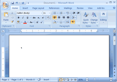
A convenient example of this is Microsoft Word. The goal of MS Word is to allow the user to compose words, sentences and paragraphs to build a document they can save and share. Microsoft did not invent the word processor, but they came to dominate the field, and dominate the users’ expectations.2
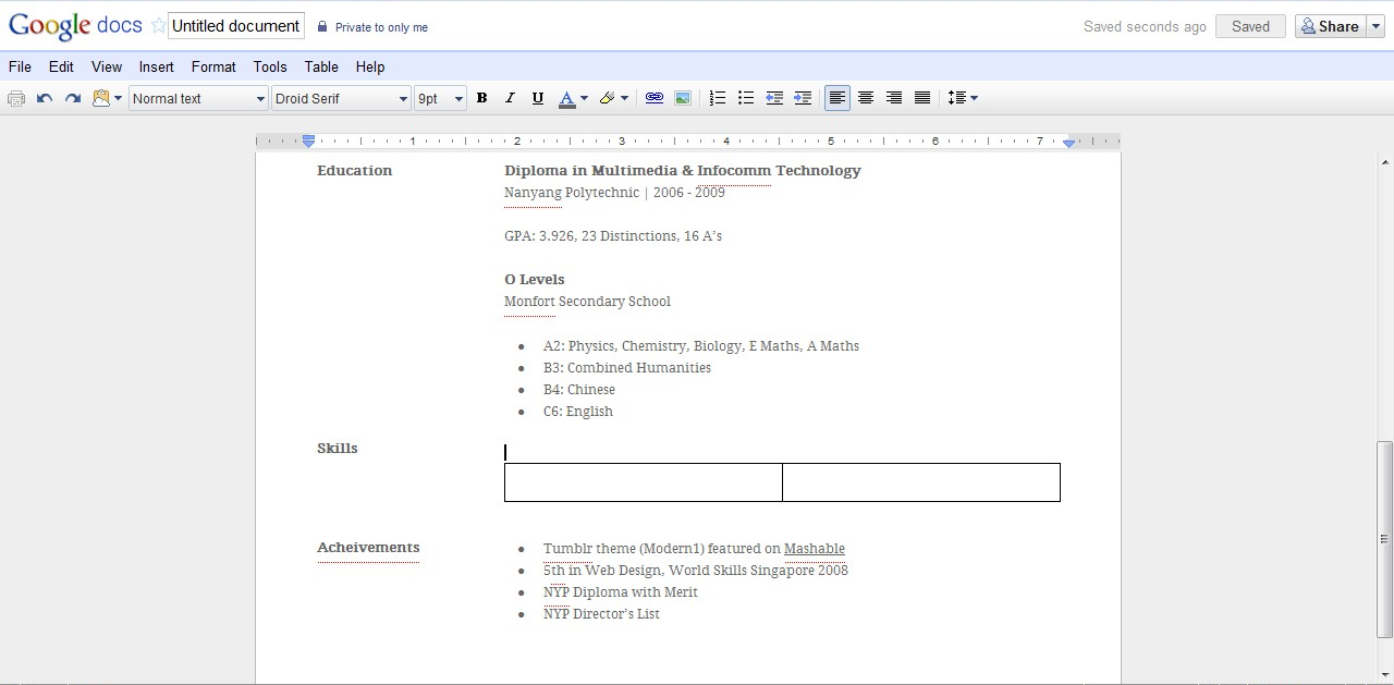
A few years back Google fielded a entrant in word processing. They revolutionized how users collaborate and publish documents – but they maintained the same clunky word-processing-interface.
There are examples of companies doing it differently, rethinking how to compose documents. Where the focus is on the content and creating it, not on keeping fifty-some buttons available for the user to alter the look of their text (arguably, often times making it look worse).
Fresh Thinkers
There are some companies doing great work in this field. Thinking fresh about how users compose documents. Especially when it comes to focusing on the words, not the style and layout. Editorially is an example that of an application that allows users to collaborate on writing and editing, with a simplified interface.
Another great example of this is IA Writer. They have removed nearly every element on the screen except for your text.
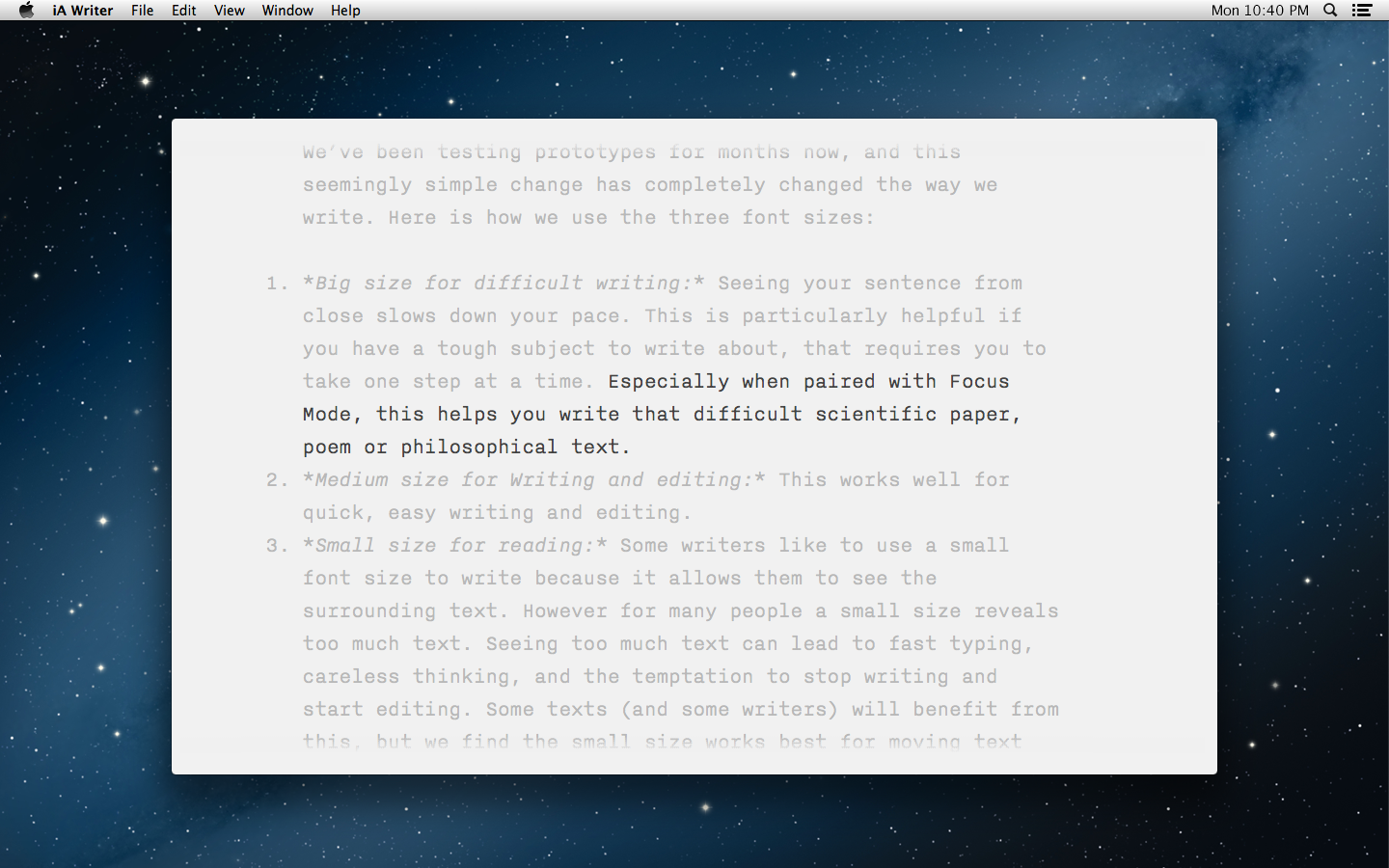
@iAWriter wrote me to mention that I had previously shown their heavy user interface in my screenshot. This has been updated. (Thanks guys!)
-
This applies to user interfaces as well as to programming interfaces. The question should always be, what level of detail does the user need to be bothered with this instant. Try to remove as much of the “bothering” as you can. ↩
-
I certainly didn’t pick the worst of the Microsoft toolbar images. ↩
Other Articles
- Starting a Gilbert District Newsletter - Sep '15 - September 12, 2015
- Write In Success! - Sep '15 - September 11, 2015
- Question – What Values? - Sep '15 - September 07, 2015
- Question – What about diversity? - Sep '15 - September 06, 2015
- Question – Staying Connected in the classroom - Sep '15 - September 06, 2015
View a list of all articles →